Portraits of Landscapes—Part 1
The Appeal of Little Spaces
It all began when I went to see the area affected by the 2011 Tohoku earthquake. Searching for an all-encompassing perspective on the devastation, I visited a middle school on a hill above the city. Beyond the schoolyard, which at the time had been repurposed for temporary housing, I stepped into a thicket, taking a footpath that could have easily been made by an animal, and discovered a secluded view of the city center. The treetops framed the grievous landscape, as if drawing a veil, while in the scant flat space before the drop-off, somebody had left two school chairs.
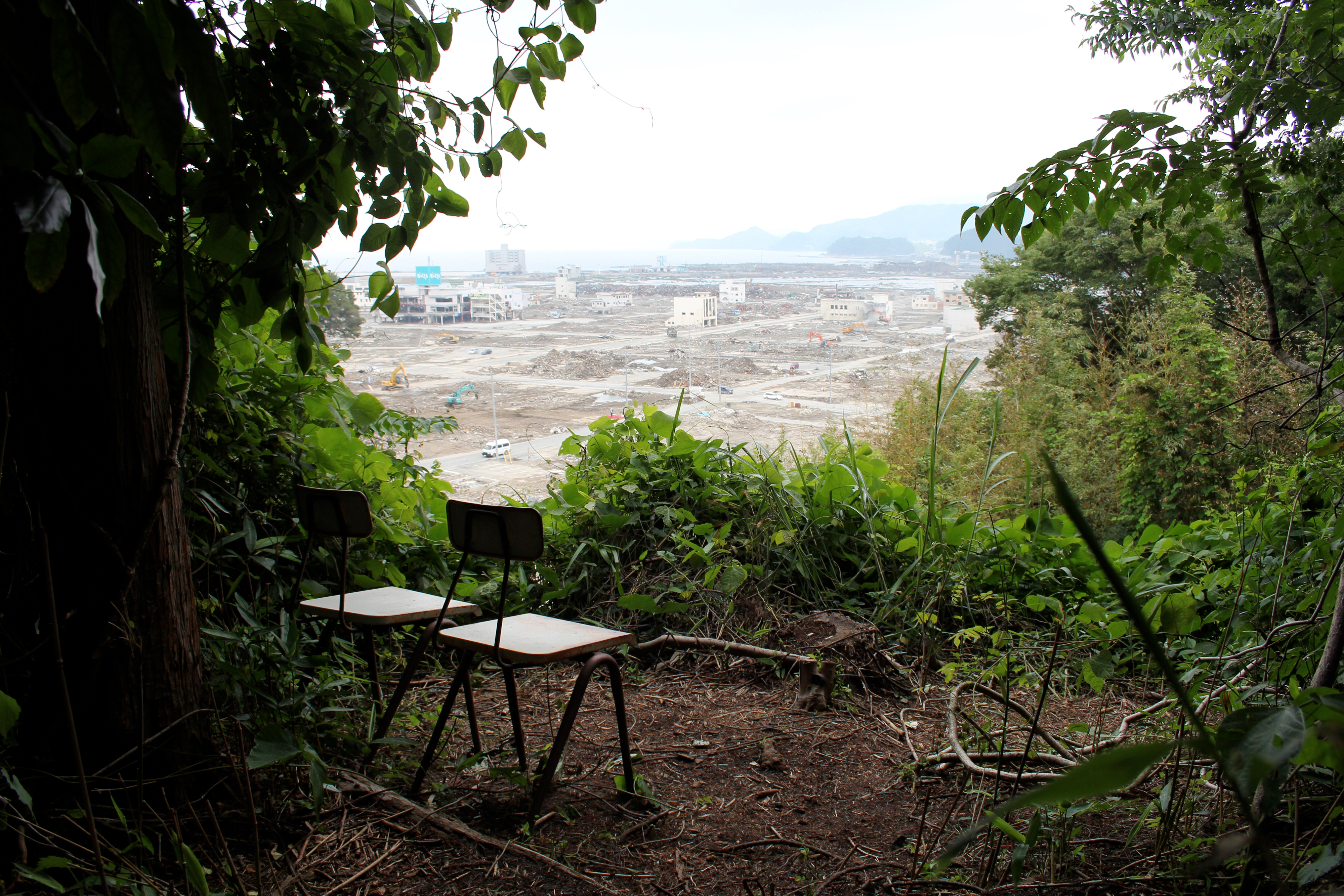
People living in the temporary housing likely used this spot to reflect on their former lives. To lend these moments stability, someone had created a space where they could look out onto the city from the shelter of the trees, and someone else had brought chairs over from the school. There was a curious spacing to the chairs, as if arranged so any two people, whether family or perfect strangers, could sit there without feeling uncomfortable. This little space felt soothing, protective even, in a way that was charged with emotion. The land may have been devastated, but this place had a special allure. Despite feeling a modicum of guilt, I snapped a picture, struck with a desire to capture the memory of this place in its entirety.
For some time, I had been fascinated by “lived places” like this small clearing. Most designers, myself included, feel a strong urge to derive lessons and models from the forms and patterns they encounter in daily life, whether they be engineered or incidental, which is why I always bring a camera whenever I go out. The layout of a small town, for example, can be a source of endless insight into how a balance might be found between humankind and nature, while the impromptu structures and patterns that abound in cities are full of surprises. Born from an ingenuity much like animal instinct, these noteworthy features tap into the innate qualities of a space and use them to increase its sense of comfort. The very sight of them warms the heart. Whenever a place gives me this feeling, I take my camera from my bag.
But after discovering that little spot above the disaster area, my curiosity reached new heights. I felt as though I had grazed some essential truth of how these little spaces are created. From then on, I made a habit of photographing anything that felt like a primary example of using space, whether a shed in the middle of a farm, a bench positioned just so in the city, or even the most unassuming trash collection point.
However subtle they may be, these sites become “centers of individual meaning” (Edward Relph) for the people who create them, or the people who discover them—and the fact that they retain appeal even for visitors is a testament to their ability to communicate perceptual space, and perhaps even evoke an air of exoticism. The sense of completeness they exude, as if finding yourself at the center of the world, is after all not so different from how it feels to stand on a city street abroad.
Education and Practice
My curiosity about lived places has direct implications on my architectural practice. Our recent work on the design of the Nobeoka Station Area Redevelopment Project has prompted me to reevaluate our stance on deeper questions, like “What are we making?” and “Why are we making it?” The once straightforward process of determining “how to make” the vision of the client a reality has been complicated by fundamental questions about how people share space.
Hoping to respond to a new kind of request, we examined the meaning of shared space and began to study the examples set by lively city neighborhoods and “community cafés” throughout Japan, but in the process, “anonymous spaces” kept on popping up. The spaces that attracted people the most contained semipublic and perhaps even spontaneous phenomena, giving them an appeal exceeding that of institutional facilities. As a designer, I found this fact impossible to ignore, a learning moment not to be missed.
What makes for an anonymous “lived” space? What is it about these places that attracts us? I’ve asked myself these questions time and time again. I became convinced the key to any meaningful answer, which would aid in the creation of appealing public space, could only be discovered through exhaustive research.
But we are dealing with amorphous phenomena. A pool of only a few samples would prove nothing, and as it stood, these phenomena could not be foisted onto architectural designs. It would be necessary to render them abstractly and figure out how they were structured. To this end, we increased the sample set, hoping to arrive at some kind of objectivity. As it so happened, my architecture students at Tokyo University of the Arts were far more interested in anonymous, lived places than overtly designed space. With their assistance, I realized I could amass a far richer sample set.
Research Methods and the Coalescing Vision
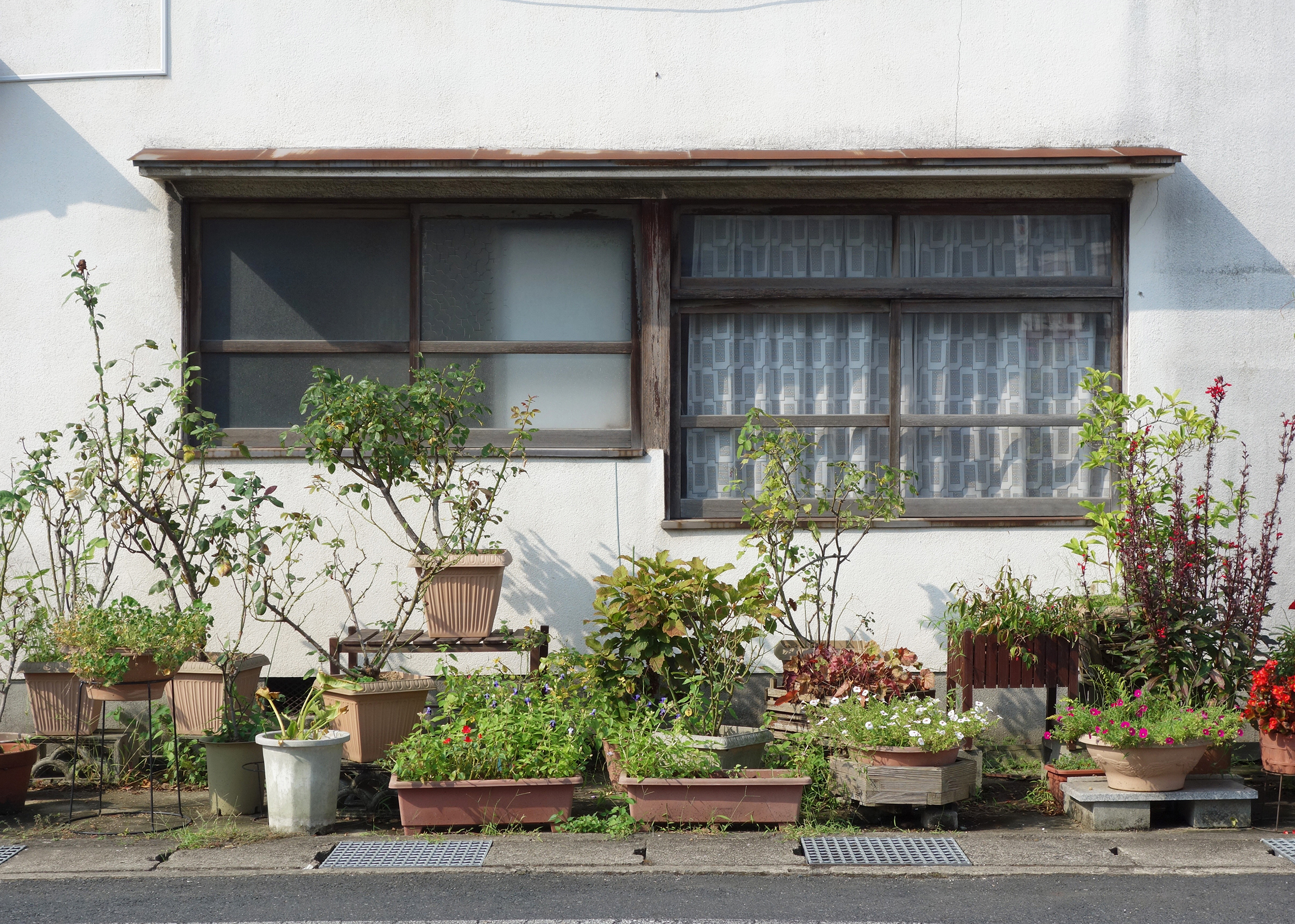
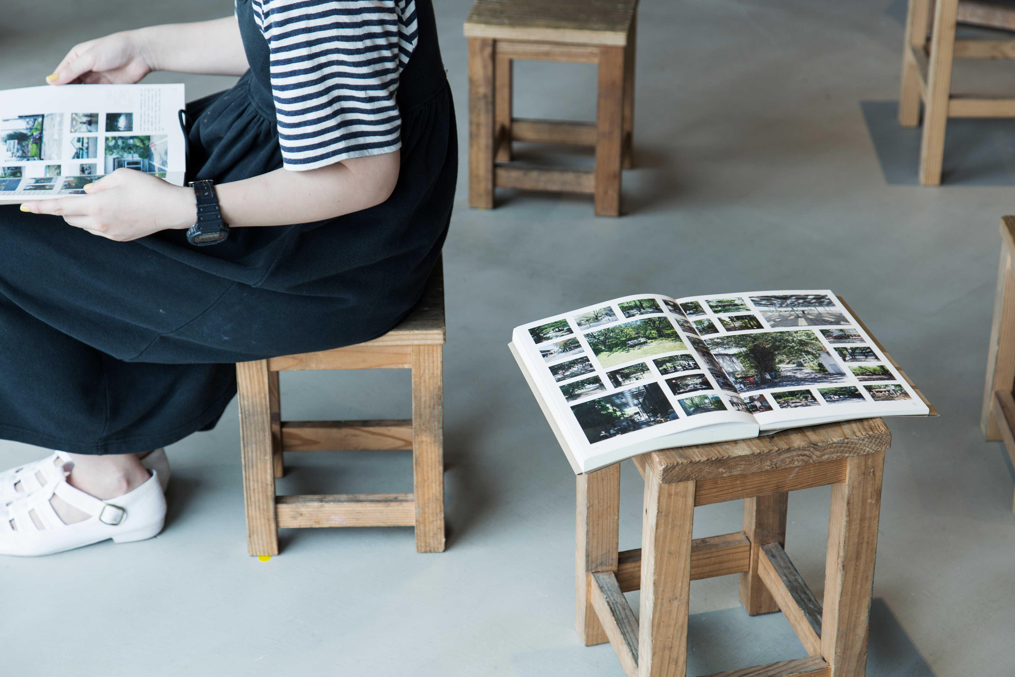
If anything sets our research apart, it’s that it was conducted solely through photography, and that our sample set was, by design, enormous. Though photos were selected based on various criteria, the most important thing was making it okay for photos to be taken on a whim, as long as you felt something there, however hard it was to pinpoint.
This intuitive factor has a way of melding the self into the “space.” When this happens, the viewer is absorbed into the visual medium, allowing the subject to be viewed objectively, for what it is. Once we had chosen photography as our research means, we hit the streets. Our mission was to capture anything or any place that caught our eye. To prevent the kind of idiosyncratic variation that would make it hard to sort the photographs, we established the ground rule that all subjects were to be shot head-on and centered in the frame, as with the “typologies” of Bernd and Hilla Becher.
When sorting through the photographs, it took more than a glance at a lived place to discover the abstract structures at play. As a first step, we grouped together photos that had something in common, sussing out the qualities they shared while determining the structures behind their appeal as lived places.
Explaining what we meant by “something in common” is no easy task. And yet, we felt that this intuitive connection to an ineffable subtext was crucial to establishing fruitful relationships between humankind and the environment. Pinning our hopes on the ultimate value of “feeling something there,” we began our search for similarities. We started sorting in the early stages, when the pool of photographs was small, and refined our perspective as we rooted out the source of common values. In the process, we dismantled and reshaped the groups, or “units,” several times.
By increasing and repeatedly reorganizing the sample set, we discovered common structures in the photographs, as suspected. Whether a certain rhythm of arrangement or a central presence in the frame, there was something essential to these patterns. Faced with this bounty of curious phenomena, we had a hunch these patterns could be used to create good designs. But adopting a generic framework wholesale would be falling into a trap, our research doomed to never get beyond the question of “how to make.” In order to respond to pressing questions, like “what are we making,” and “why are we making it,” which border on the philosophical, we needed to work patiently and grasp that special “something” indicated by the patterns.
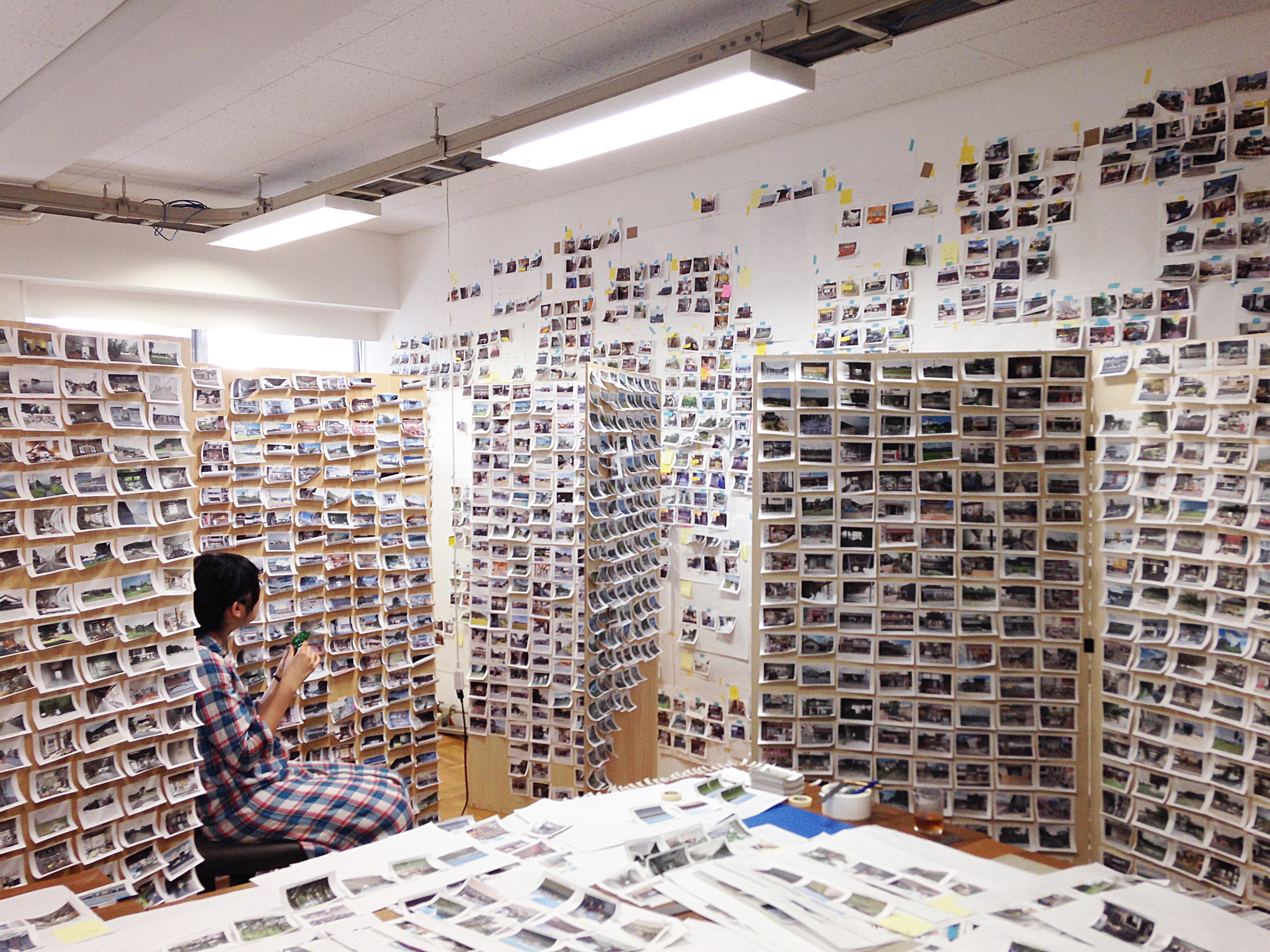
Discovering these spaces became a daily practice. As we sifted through cascades of photographs, I was intrigued to find we were developing a unified perspective. Eventually, we discerned a tremendous gap between what was generally appealing and what was not.
However, a logical connection between the most appealing scenes was not immediately clear. We might find ourselves captivated by a soothing patch of shade dappled with sunlight, but equally charmed by the unnatural spectacle of a parade float made from recycled plastic food containers. Some patterns are the product of commercial practices, while others are the doing of communities or individual citizens. They could be elements of infrastructure, like a bridge over an irrigation channel, or the channel itself, or no more than a plant. The human element could be overt or subtle. Yet despite the wide swath covered by these patterns, they all carry a similar “appeal.” It was mystifying. We began to think that this special “something” all of us had noticed was the source of whatever makes lived places so attractive.
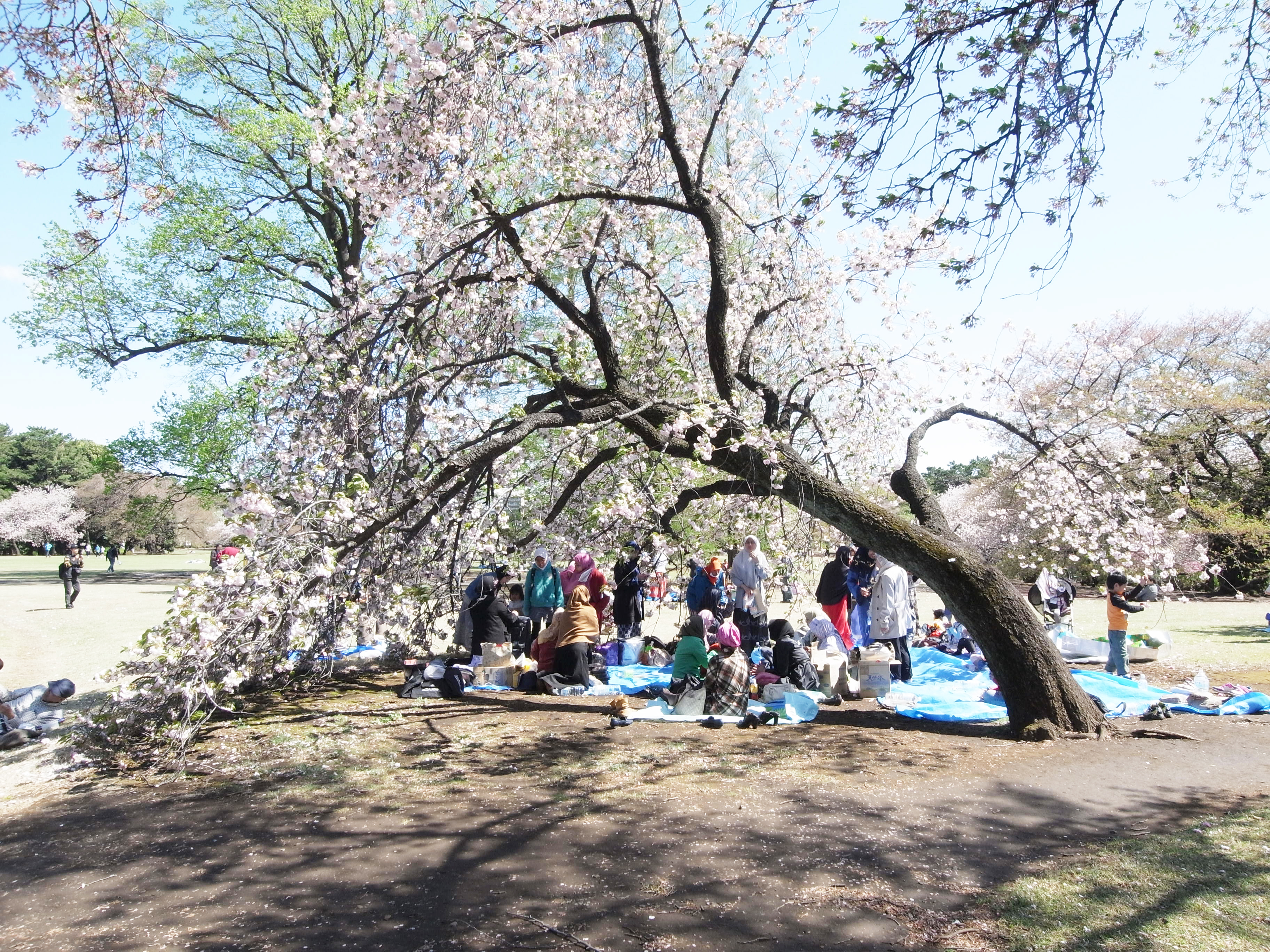
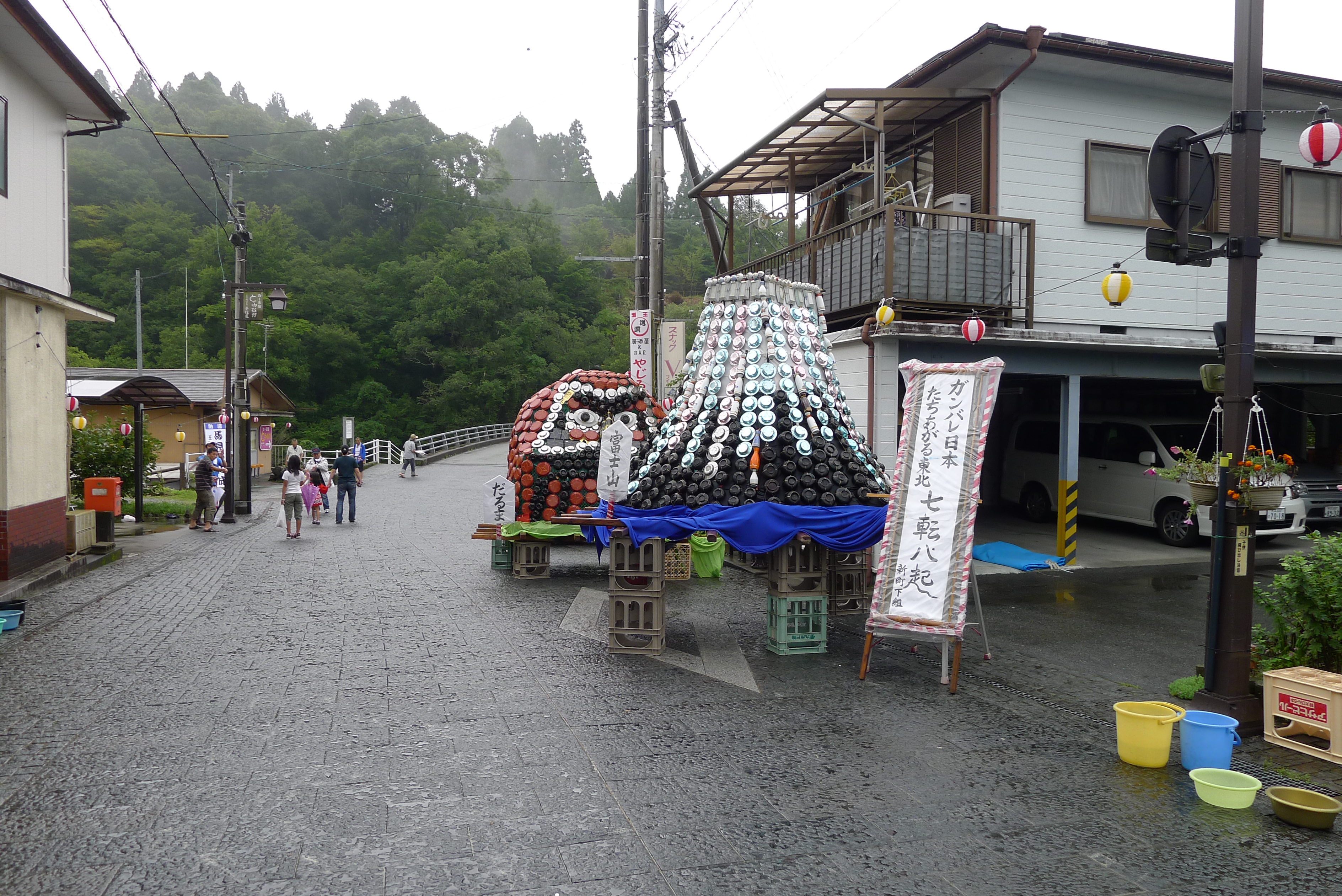
How could we go about evaluating the plainspoken beauty of a sun-dappled clearing under the same rubric as a parade float made of food containers? We struggled to pinpoint a single term. Feeling stumped, we forged ahead with our research, but in the last round of selecting and organizing photos, the word “service” popped into my head. Looking back, when we discussed an object or a space that felt distant from a refined design aesthetic, as exemplified by the food container float, or considered a noteworthy scene from daily life, we were unconsciously agreeing that “what makes the difference is a spirit of service,” but once we found our unifying concept, we realized the perspective went beyond human involvement.
(To be continued to Part 2)
All photographs courtesy of Kumiko Inui, Inui Architects, and the Inui Lab at Tokyo University of the Arts.
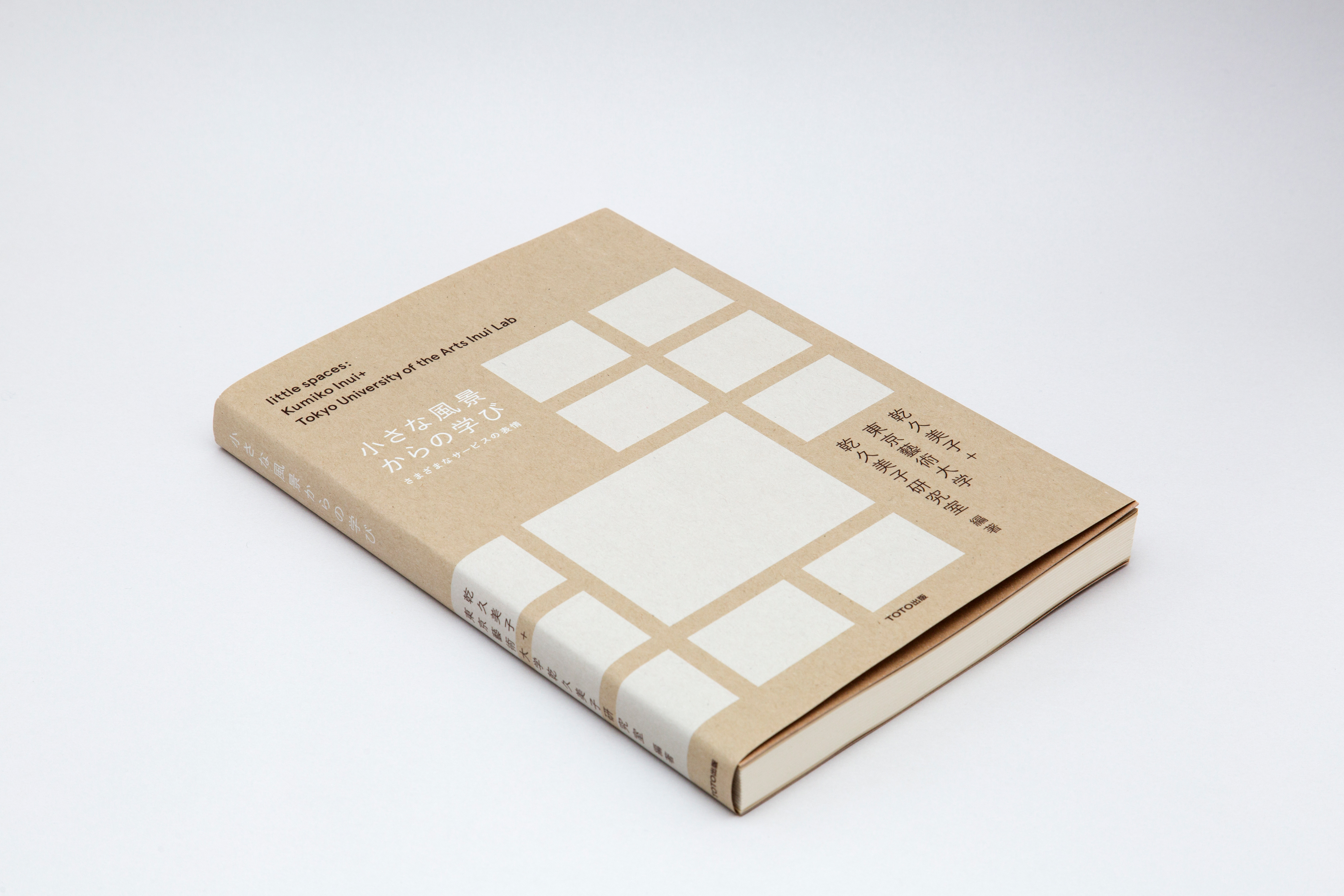
This essay and the associated research stories were originally published in the book little spaces (TOTO Publishing, 2014) by Kumiko Inui and the Inui Lab at Tokyo University of the Arts. Their publication on Japan Story was made possible by the courtesy of the authors and the publisher.
- Kumiko Inui is the principal architect at Inui Architects and a professor at the Yokohama National University Graduate School of Architecture (YGSA). Acclaimed for her innovative architectural thinking with a focus on regional cities, she received the prestigious Architectural Institute of Japan Award for the Redevelopment Project for the Nobeoka Station Area (Nobeoka Encross) in 2020.
